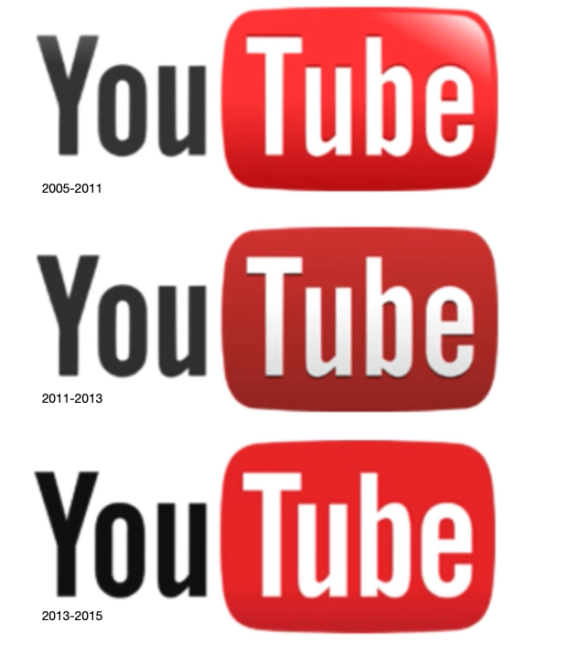
The YouTube logo is a logo that has not changed much, but has changed frequently. Every few years the logo is changed slightly, from looking 3 dimensional to 2 dimensional, to a gradient color, to a flat color. From a lighter red to a darker red fluctuating between every logo. And finally a change in order of words and images. Here you will read all about the logos through the ages.
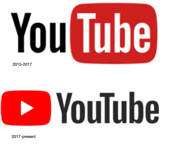
Now that you have seen the the immense fluctuations of logos through the ages of YouTube, what do you think will change, and what improvements do you have for the the final logo, and which logo Is your favorite? Personally I like the current YouTube logo.
I’m Get Yopol and That’s My LogoType!


 1992:
1992: 


